Friday, November 13, 2015

A city of built landscape typologies

On the Cities: Skylines reddit I saw someone posted a link to this journal article which outlines 27 different types of built landscapes, ie street patterns. I thought this was pretty interesting and could be used to make a realistic looking city in the game. Of course, instead of making an actual city, I just did a bunch of experiments, and once I got all these different street patterns into a city, it ended up with a population of 30,000.

So what I did was pick a consistent zone type to go with each built landscape that I thought worked best based on what was described in the article. So here's a shot of each zone, some of which I'll definitely be using in future cities since they look quite nice.

Allotment Gardens: For this I used low residential, trying to focus on 1x4 and 1x3 to give a nice effect of having backyard gardens. This part kind of got swallowed up by the rest as it was the first one I built, but you can get an idea of it from the pictures below.


Apartment Blocks: 2x4 High Density Residential:


University Campus: University with some sports and meeting facilities attached, with some small scale offices and high density residential in the upper right corner.


Commercial Strip: 2x3 low density commercial along a straight road, with 2x2 low residential on the branching streets.


Country Roads: A single road (which started in the country but then get swallowed by the expanding city) with 2x3 and 2x4 low residential.


Degenerate Grid: 3x2 low residential. I really like the look of this one.


Garden Apartments: 1x4 high residential. This one created a neat effect of all concrete, which wasn't what I had in mind by trying to recreate gardens, but it still looks interesting.


Garden Suburb: A mixture of 2x4, 3x4, and 2x3 low residential.


Heavy Industry: Primarily 4x4 industry.


Incremental/Mixed: A mixture of 2x2 high residential, 3x3 low residential, 1x1 low commercial, and 2x2 office.


Land of the Dead: Originally this was just a cemetery, a park, and two crematoriums, but then I added a prison because it looked neat, and then a recycling plant and an incinerator, and then it got swallowed by the city, but still looks interesting.


Large Blocks: Combination of 2x2 and 3x3 high commercial and office.


Loops & Lollipops: 3x3 and 2x3 low residential.


Malls and Box Stores: 4x4 low commercial with connected walkways. Perfect for an IKEA!


New Urbanist: low density commercial on the bottom, 2x3 and 3x3 low res in the middle and 4x4 low residential on the top with a nice feature in the middle.


Organic: 1x1 high residential, high commercial, and office, and 1x2 low residential and low commercial.


Quasi Grid: 3x3 and 4x4 high residential, with 3x3 high commercial and 4x4 office on the side.


Rectangular Block Grid: 3x4 and 2x4 low residential.


Rural Sprawl: 4x4 low residential, spread out.


Superblock: 4x4 and 3x3 high residential with lots of connecting pedestrian paths.


Trailer Park: 1x1 low residential with a few 1x2 and 2x2 low residential.


Upscale Enclave: 4x4 low residential. Lots of trees!


Urban Grid: High density residential, commercial, and office, European themed!


Workplace Boxes: Offices with lots of parks.


Tuesday, November 10, 2015

More circles!

I was looking for utopian city layouts the other day and came across an interesting one on a website which is now down, so I won't link to it. I did save this image from it that demonstrates the basic layout:

It's funny that utopian cities always seem to be circular, anyway this one seemed interesting mainly because it has zoning and could connect a bunch of these circular hubs together to create a city of circles. Of course, I only actually made one city in game because I can't seem to stick with any one idea for very long. I implemented the circles on the outside ring as roundabouts and I was going to use each roundabout to connect to another circle like in the small diagram top right, but I never got around to it.

Here's what the final product of one of these circles looks like in game:


I like this circular design because the roads are for the most part fairly straight, allowing zoning to be more efficient. High density commercial and office in the middle, then a ring of high density with the rest being low density. There are squares of low density commercial/schools/park/city services as well. Here's a picture of the zoning:


Of interest, there is no road connection to the rest of my city. The industrial area on the right is fed by a cargo harbour on the river, and the very centre of the circle has a passenger train station with tracks immediately going underground, which makes it a kind of high capacity subway using trains rather than the metro system.

As you can see below, the tracks go right underground. Also you can see that this station is insanely popular, given that there are no roads to connect with the rest of the city, which gives it an automatic 100% efficiency:


There is also one bike path connecting the outside of the circle to the rest of the city. It's also fairly well travelled:


While the need for industry does somewhat break the circle pattern, if one was ambitious, one could make a connecting circle entirely for industry. Overall this circle design has around 12,000 people, but could be more as the average building level is not very high. This is a nice-looking design pattern, especially if you stick a few tall landmark buildings in the centre like I did. I think this is my most successful experiment so far, and if I run out of other ideas I'd like to take this one and try to make an entire city out of these connecting circles like in the design at the top.

Monday, November 9, 2015

Mixed use experiment

One of the biggest trends in urban planning is mixed use zoning. This is problematic in game because cims don't like noise and they don't like pollution, which means they don't want to live near industrial or dense commercial. Practical mixed use zoning in the game, like in reality, is more along the lines of mixing low and high density with some office and light commercial. But I thought I'd try to create some monster mixed use zones that added in everything to see what would happen.

I used the pattern of LR-LC-I-HC-O-HR and repeated this as a chain down very long streets. How much of each I zoned was dependent on the RCI bars. Here's an overall view of this part of my city:


So as you can see I've got everything mixed in there on very long street, with only bike paths as cross connectors, which can also take you to the mainland. With the long streets and well travelled bike paths there isn't much traffic. Cims don't have to go very far to get to work or shopping, and traffic between industrial and commercial is pretty light. There is some degree of traffic for industrial imports, but considering how spread out the industrial zones are, even the heavy truck traffic is fairly light:


I also kept each side of the street the same size. So the very top of the top street is all 1x2, then the next road is 1x3, all the way down to 4x3 and 4x4 on the bottom street. I did this to make sure my zone buffering layout stayed relatively even. This way the 4x4 industry which makes so much pollution would have a bigger buffer of other zones between it and the commercial.


This experimental layout is fundamentally flawed though. The pollution from industry causes sickness all over the place, and I had to put in a hospital and cemetery just to deal with this problem. So it's not recommended unless you want sickness and dead body icons all over the place. It is decent for traffic though.

Despite the sickness problems, the area actually did a pretty good job of levelling up as you can see from the picture below. Industry and commercial almost maxed, and residential well over 4, with office being the only one not levelling up as well.


So overall, aggressive zone mixing doesn't work that well, but it's also not terrible, especially if you're worried about traffic or getting buildings to level up. I mainly don't like it because I hate seeing the dead body icons, as they make me think I've got a death wave incoming. I guess this layout could be good if you don't want any seniors in your town, as the pollution seems to keep life expectancy low!

Sunday, November 8, 2015

Experiments in Brutalism: Le Corbusier's Ville Radieuse

Since Cities: Skylines allows you to essentially build your ideal city, I thought I'd experiment with building one of the most famous ideal cities. La Ville Radieuse was the urban planner Le Corbusier's ideal layout for a city. It was based on the human body, with a head, spine, body, and legs, and was supposed to create good circulation, like how blood flows through the human body. Le Corbusier saw his ideal city as a well ordered environment that could create a well ordered society. Le Corbusier was influenced by French utopianism and thus associated himself with various political movements which spanned the political spectrum, from far left syndicalism to right-wing fascism. La Ville Radieuse was meant to create a city layout for a society that was essentially non-political, as it aimed to maximize order and bureaucratic efficiency.

Here is his layout for his ideal city, La Ville Radieuse:


This layout will work nicely with the game, because unlike many ideal city designs, this one actually includes industry and isn't merely a residential layout. Since Le Corbusier was big on density and tall buildings, I'll use mostly high density. The main "spine" up the middle will be a highway, and I'm going to replace the green area separating the industrial zone at the bottom with a river, since that's what will fit on the map I'm using.

Here's an overhead shot of my final creation:


It holds around 17,000 people and is basically a nightmare to look at. Traffic is not too bad due to the fact that there are roads basically everywhere. The only real logjams are in the circle at the top and the "neck" of the city. The roads create some awful intersections in the body, basically replacing any potential for public space with roads. Le Corbusier's critics called this plan "buildings in a parking lot" and that's basically what I've created. Here's the road and traffic situation:


The most interesting aspect of the city are its divisions into zones. With the industry zone on the bottom, I have 4 resource processing zones for each of the 4 types of resources at the very bottom, with generic industry filling out the areas between the bottom and the river. This turned out to be a pretty effective way of keeping tabs on the supply chain situation. When my forestry processing area started to import materials, I knew I needed to expand my forestry raw materials sector, which is off to the side of what's shown here. This industry area is fairly well organized and brings in a lot of money. Here's a close up of the industrial zone:


Up the highway spine, I have the commercial area, with high density along the highway and low density bordering the residential zone. I also have metro stations along the main spine. Here you can kind of see the commercial zoning:


The high density residential areas that make up the bulk of the city are a true concrete jungle. The radiant street pattern makes everything seem completely disordered with buildings facing every possible direction:


World's worst intersection:


Looking at the layout design, Le Corbusier calls for very large sections for hotels and embassies directly above the residential part. I zoned these as tourism with leisure inside of the circle that terminates the highway:


Next is the neck, which I used to create a nice central plaza with a train station, park, and metro station, and the head, which is zoned as office. The arms are light residential with a university in the right hand and a cemetery in the left hand.


Overall I find this to be a pretty unappealing city which I think actually lacks the well-ordered effect that Le Corbusier was after. If I expanded the area somewhat and reworked the road system, it would do a better job of capturing his plan for symmetrical building alignment. On the plus side, the separated industrial area works nicely and there is massive usage of passenger trains!

Sunday, November 1, 2015

Getting people to ride their bikes

With the After Dark expansion to Cities: Skylines, bike paths and bike lanes were added. In my opinion this alone made the DLC worth buying, as I'm a huge fan of cycling infrastructure.

So in this experiment, what I set out to do was create a low density suburb type area that was all residential and connect it to the industrial and commercial sections primarily through bike paths. I have a very broken roundabout that is two way for some reason (it came with the map) coming off the highway. There is one road from the roundabout to the residential area and then one road which leads to the commercial and industrial area. The fact pretty much all motorized traffic has to go through one traffic circle (and a broken one at that) caused an absolute traffic disaster. This, however, was fine by me because I wanted people to ride bikes from the residential zone to the rest of the city, and I figured if taking a car was a huge pain, it would encourage more cyclists.

Here's a picture of the general layout of this bike suburbs part of the city. I've added a bunch of other stuff, such as the highway interchange and roads going to other places, but the basic idea of the original bike suburb is still there.


The part on the left is all residential while the top right is industrial and bottom right is commercial. So obviously for people who live in the bottom left, if they wanted to get to the bottom right commercial area, it's a long drive but a very short bike ride. When I first started building this, the bike paths were flooded with bikes. It seemed my experiment in traffic terror was working at encouraging cycling. I put in bike lanes on major roads in order to facilitate cycle-commuting and the number of cyclists continued to grow:


Then I had the idea that I should put in a bus route along the one road connecting the residential zone to the other two zones. There were some issues with not enough workers, so I figured that the game probably has it programmed that only a certain percentage of people can ride a bike or something. So I added the bus line, that you can see here in red, and it caused even more traffic problems on the one road. I thought, "ha, cycling is now an even better way to get around!"


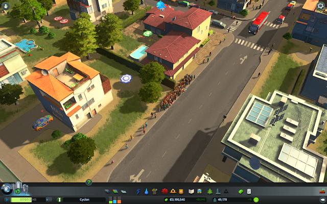
But apparently cims would rather wait around for a bus that never comes because it's stuck in traffic all day than ride their bikes! As soon as I put in the bus line, the number of cyclists plummeted! This was the scene at all of the bus stops in the residential area:


Even worse, as I sat there and watched people, eventually they would spawn cars and drive into the traffic circle of doom, making traffic even worse! Apparently cims love public transport so much that they would rather walk across half the city and wait around all day then take a short bike ride to get to their destination. All this with with the encourage cycling policy activated too.

I'm not sure what is causing this behaviour, but perhaps my cycling paths are too short. I've noticed that my longer distance paths tend to have a lot more traffic than the shorter ones. Adding a walking path beside one of my shorter cycling paths led to a huge influx of pedestrians, so there may be something to the idea that cims would rather walk short distances than ride their bike. This doesn't really explain why they'd rather wait around at a bus stop all day than take a quick bike ride though.

Saturday, October 31, 2015

Making Nice Public Squares

The key to a nice looking city is, in part, having open public spaces. Public squares are more common in European than North American cities, but they tend to be what defines a city as they are common meeting places and centres of pedestrian traffic.

In Cities: Skylines there a few ways to create public spaces. What I like to do is start with some sort of central feature, build roads around it in a way to leave enough open space, then try to fill in the public square with pedestrian paths to give it a feeling of being paved. It's hard to get this paved effect, but filling in the spaces with trees can make these public spaces look even more realistic and attractive. Here are some examples.

Here are a couple of pictures from a square that uses the fountain tourist unique building from After Dark as its main feature, along with a Japanese garden, a subway stop, and a prominent bus stop:


With all the pedestrian paths giving the illusion of pavement, it also makes cims walk through the public square making it look very busy. In addition, on the left you can see a train station, so the public square acts as a public transportation hub as well as a place to hang out.


Another example of a public square, this one combines some unique buildings on one side with a small statue and a train and bus station.


This area was bigger, so I couldn't quite get a pavement effect with pedestrian paths, so I added a fair number of trees which also works to make this an attractive public space.